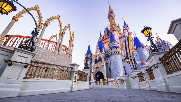
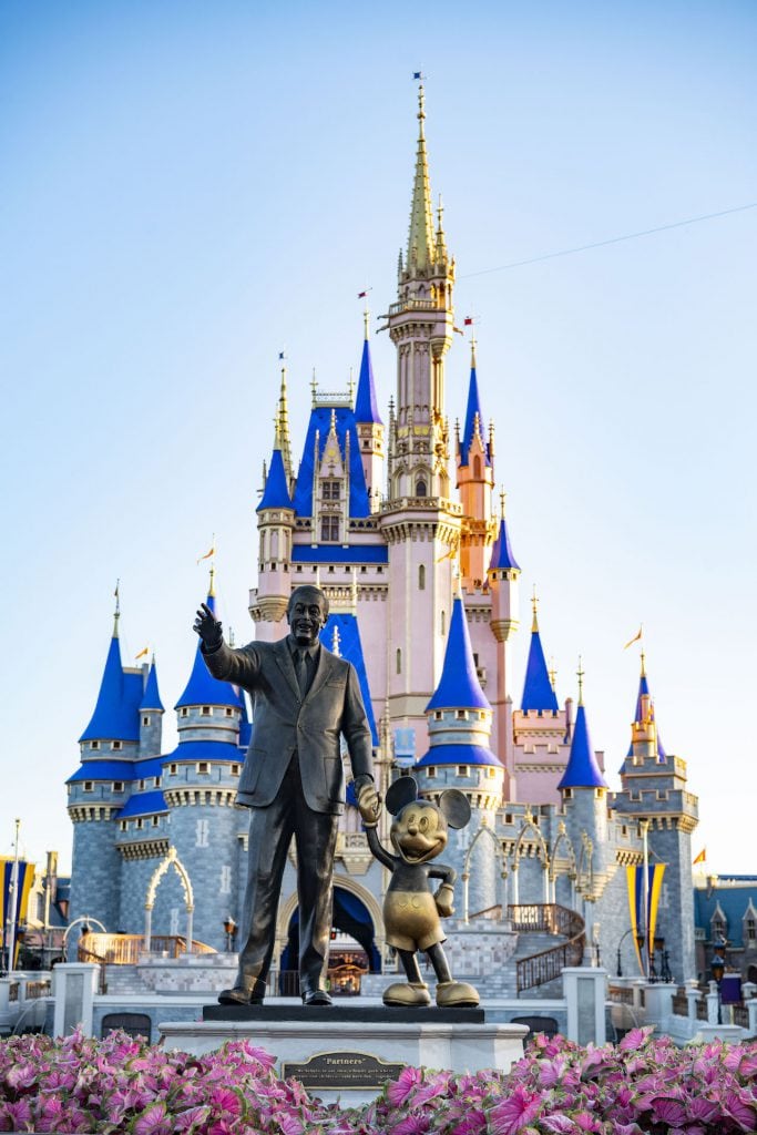
I have spent more time photographing Cinderella Castle than any other single structure at Walt Disney World Resort, so I was very excited to capture the castle with its new royal color scheme. This time, I wanted to see how the new colors would transform some of my favorite vantage points that I know so well here at The Most Magical Place on Earth.
Having spent several mornings now at Magic Kingdom Park photographing this new look for the iconic castle, I’ve come to know it quite well. I love how the new colors pop, how certain details – perhaps unnoticed before – stand out with the gold overlay, and how the castle “glows” now when hit by sunlight.
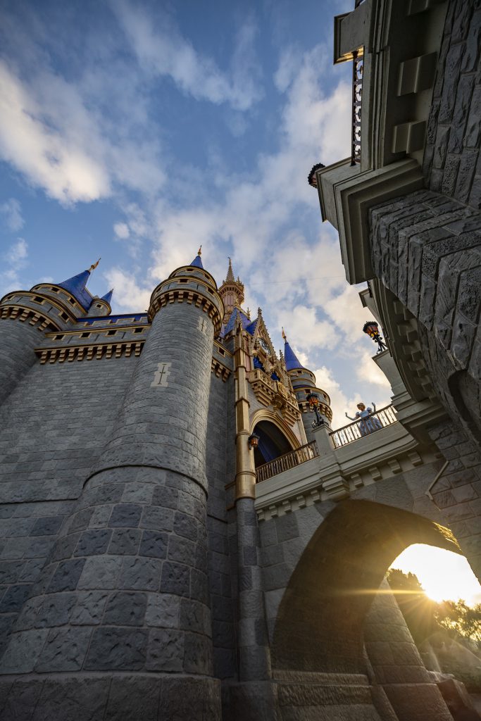
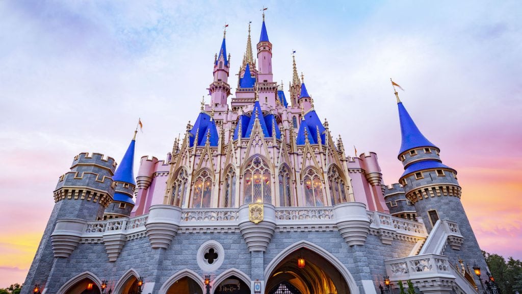
There was one angle, though, that I could only capture during this special time. While the work was being done on the castle, the water in its moat had to be drained. Taking advantage of this rare occurrence, I arrived early one morning and was able to walk down into the moat and photograph the castle from a rarely seen angle. From this perspective, Cinderella Castle takes on a whole new level of grandeur.
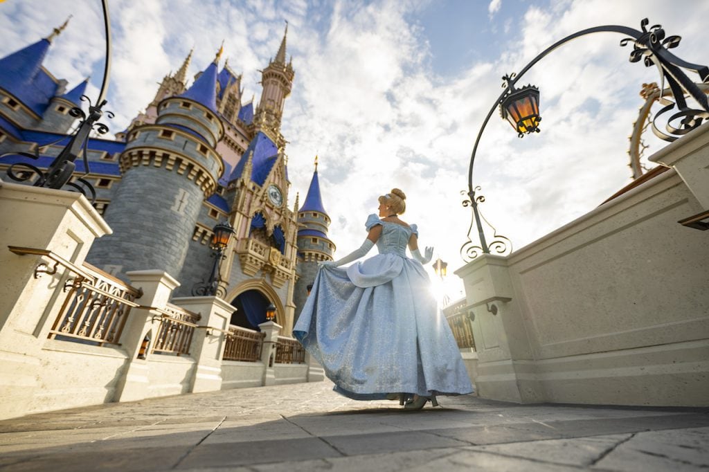
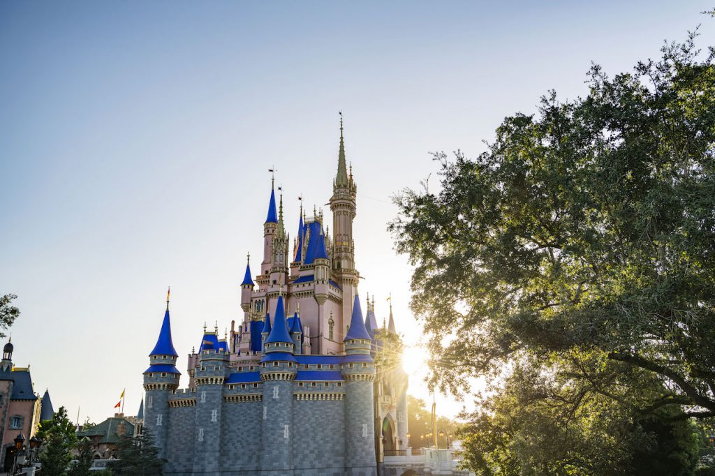
It was icing on the cake for me to photograph Cinderella in front of her namesake, just as the sun was coming up. She brought the castle’s new look to life in a way only a princess can.
Comments
I do not like it. It looks fake! Change it back, please.
Listening to those around me I hear so many complaints on it being a copycat. We should have kept our colors, it made it unique to Cinderella 😥
They ruined it.
Amazing, I loved the old colours but now need to book my next holiday to see the new colours – beautiful, magical place best place on Earth in my eyes.
Actually, Michelle, the recent new color scheme for Disneyland’s Sleeping Beauty Castle is supposed to mirror the way castle looked in 1955 (remember, “Sleeping Beauty” was delayed and wasn’t released until 1959). If you want a comparison, look up the original 1955 Disneyland guide book cover (although the castle might be the original park miniature model). It looks nearly the same. Although, I agree that Cinderella’s Castle should’ve kept their original 1971 color scheme.
I think it looks fabulous in the Sunlight. It also seems to connect to the buildings on Main Street in a subtle way.
I’m with Steve! I am dying to get some HQ pictures to use as a background for my computer!
Do not like it
This looks WAY too similar to Sleeping Beautys castle. A complete copy of hers and totally an let down to Cinderella. It looks nothing like the movie. I was so disappointed in my Disneyland experience, it didn’t feel authentic to the movies at all.. and now feel I’ll be disappointed in Disneyworld as well. Beautiful… But not right for Cinderella.
I sense sarcasm on Michael’s post….
I admit I’m a bit disappointed on changing the original color scheme for Cinderella Castle to Sleeping Beauty Castle’s color scheme, though it does like good in wide shots.
Just made the second image my new screensaver!
INCREDIBLE!!!
Great photography, but that blue is atrocious. It makes the pink looked faded and old. The extra gold is a nice touch. Maybe it will look better in person.
It’s nice to see the castle getting the same color scheme as Sleeping Beauty Castle as the beginning of homogenizing all the castle parks. Will all the castles be be called Sleeping Beauty Castle or Cinderella Castle? I’m so glad all the distinctions between parks are disappearing!
such beautiful pictures! can’t wait to visit magic kingdom and to admire the new colors!
Great shots! Would love to see some higher resolution images posted so we can use as backgrounds.
Comments are closed.