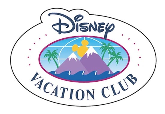
Since 1991, the Disney Vacation Club logo has symbolized a unique approach to delivering vacation experiences at Disney Parks and beyond. Sporting a Mickey-eared sun rising above snow-capped mountains flanked by swaying palms and fronted by rolling waves, the logo was designed to change the way families think about vacationing with the mouse.
Now, with Disney’s innovative vacation-ownership program having grown to include more than 500 vacation options across the globe, and with its member community having grown to represent more than 100 countries and every U.S. state, the Disney Vacation Club experience is about more than mountains, beaches and Disney Parks.
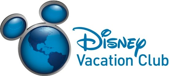
It was with that growth in mind that artists recently re-imagined the logo by dramatically widening its perspective, topping the entire globe with those familiar ears. More than just shiny eye candy (though it’s hard to go wrong with shiny), the new logo represents an ongoing commitment to helping families expand their vacation horizons and travel in ways they never dreamed possible.
After all, it’s a small world. (Wait, I think I said that backwards.)


Comments
We’ve been DVC members for about 7 years now. I never got much pizazz out of the old logo and it was time for a redesign.
But this should have been tried out on some focus groups (and, gosh, if you tell me it was, I’m going to be very disappointed in my fellow vacationers). This says nothing at all about DVC — only about Disney vacations and only in the western hemisphere.
ybe it’s not too late to admit a mistake was made and go back to the drawing board?
Full disclosure: I’m a DVC member and have the seen the old logo for some time. There’s no question that there’s a lot to criticize about it. The supporting typography felt weak to me (always has) and always wondered about those dots… And while the illustration seemed appropriate for the time it was looking pretty dated. I’m also sure they spent only a bit of time designing this when the program was new and they were trying to get it off the ground. And it HAS gotten off the ground. Very popular. But recently it felt to me like that could have been updated.
Having said all that, the new logo feels to have no character at all. It could be applied to any Disney subsidiary or internal organization (and god knows they have a lot). One of the nice things about being a member was the feeling that it was unique and you could spot another member easily.
This new logo just feels very bland and not terribly special.
I am not fond of the new logo. It doesn’t symolize vacation or fun or family. It does not make me think DVC.
I’m not too keen on it but I will give it a go! Slap it on a hat and let me wear it on the cruise to be seen for giveaways.
When I was a Cast Member in 2003 when we changed the color of the CM nametags from red to blue; I was very much against it. I chanted, “You are ruining a piece of nostalgia.” I then saw that the new blue nametag had a hidden Mickey in a trail of pixie dust and it became my favorite of the 8 or so versions I had over the years.
We should all give change a chance, and if does not work I am sure DVC will respond. GAP revoked their new logo when public reaction thought it was not well thought and that it lessened the value of the brand.
Its nice to see so many members giving honest reactions here.
Boring. It took someone an hour in Photoshop with a piece of clipart to dream that up. It’s cold, impersonal, and bland. It doesn’t make me feel like a Guest, let alone a Member – it makes me feel like a cog in a machine. I also don’t understand this new emphasis on “500 other destinations.” My family doesn’t care – we bought DVC to stay in the magic, not to globe-trot.
What’s worse, the new logo isn’t even being used consistently. All the back-of-bus billboards at WDW show pictures inside the large circle of the globe – so this is even less of a “logo” and more just a piece of art template to use in advertising.
That’s my problem: This new logo, and the explanations behind it, seem entirely focused on representing the Club to prospective members. What about those of us who’ve already joined?
If this new logo is what DVC needs to market to prospective new members, fine – how about giving Members our own logo? One that’s more personal, more charming, and that has more warmth? Something that says, “Welcome Home. You’re special.” Frankly, I wouldn’t take a FREE t-shirt with the new logo… whereas I’ve bought innumerable merchandise items with the old one. If you take away the words on the new logo, it’s meaningless; the words “vacation club” were an intrinsic part of the original logo.
Something else to consider: Disney fans are HUGE on nostalgia. Nostalgia plays a major part in all of the theme parks’ theming and lands. Look at the ruckus that arises when one of the parks has to take out a beloved old attraction! Here, you’ve worked AGAINST nostalgia by taking away the original, classic logo that we’ve all been fond of and giving us something that offers no way to make a personal emotional connection.
As a business, DVC needs to ask itself: WHY did we change the logo? Did we do it for our Members, or for ourselves? The reasoning I’ve seen so far suggests that latter, and that’s not a good reason. If you truly needed to represent, “an ongoing commitment to helping families expand their vacation horizons and travel in ways they never dreamed possible,” you could have done that by creating appropriate artwork for specific ad campaigns (the “best kept secret” campaign was always, in my opinion, poorly thought-out given the ubiquitous presence of DVC booths in every corner of every park).
I’m guessing this new logo was the result of many – too many – conference room meetings. You don’t create charm and excellence in committee, guys. Sorry.
I have to echo other’s statements.
I don’t like the new logo.
DVC is not even part of the logo itself.
Wonder how potential members in Japan will like the logo when you cannot even see their country?
The new one doesn’t say anything about vacations. It also ignores Europe and Asia, two locations I have/would like to use my DVC membership.
Loved the old logo; not loving the new one.
I like the old logo better. Besides, the first rule of brand identity is “don’t change your logo.”
Really disappointed with the change 🙁 Some things are classic and should just be left alone.
Hate it! as DVC member since 1995, I like the “feel” of the old logo. what’s next? eliminate “Welcome Home” when I check in?!
Not a fan. It’s very modern and techy. I liked the old logo and the vacation type feel it had a about it. This is just a global Mickey…
Not sure how I feel about the new logo. I agree with Carissa that it is a tad bland.
But I expect a nice limited edition pin to go along with it so I’m appeased!
Totally bumming on the new logo. It is very generic, has no color and doesn’t represent vacationing at all. I’m a new member and I’m sad that the old logo won’t be on any new materials. Any chance you can change it??
I agree with David from WI… I too have been a member since 1992 and I thought the original logo was a lot more fun! This new logo is very generic and cold; it’s not inviting at all. I’m so glad that I have items with the original logo. Don’t think I’ll be buying any of the new items. I wish members had been given a choice of logos and allowed to vote.
I usually don’t post things here on the blog but I had to comment on this. I do not think the new logo is an improvement over the old. The new logo does not scream DVC. It is just the world in the shape of Mickey Mouse. The old logo truly captured the spirit of DVC. With your membership you can visit Walt Disney World (The mickey sun), go skiing in the mountains, visit the ocean side resort (the waves), or some place tropical (the plam trees). When people see the old DVC logo it is something unique. They say, “Hmm, what’s that?” With the new logo, they only see the world in the shape of Mickey’s head. Please rethink this logo change.
I like the old logo. I agree that it could use some updating, but the new one is so cold and metallic. It doesn’t say “Disney magic.” I wish I had bought more of the old logo things. Does anyone know if they will be selling the old logo clothing and/or memorabilia? If so, where can I get it?
Thanks
I have to say that I like the old logo better. Maybe it’s because I’ve been a DVC member since 1992 (there were 3 mountains in the original logo). I agree with those who have said the new logo is too generic (it would make a more fitting logo for the Walt Disney Company in general. The new logo does not imply “Vacation!” like the old logo. The old log does have global latitude and longitude lines in the background to convey the worldwide nature of the DVC, so I don’t think there was a need to go “Global Mickey” and leave out the vacation fun aspect that the new logo has obviously done. Glad I own some now “classic” DVC logo merchandise.
Nice
The new logo looks like every other business logo…boring. The old logo has bright colors and screams fun! So from a business point of view it is sterile and cold but I thought DVC was business selling fun and memories? Why doesnt DVC combine the new logo with fun colors.
I definitely miss the colors of the old logo and the fun and excitement that the color represented. I agree that the new logo feels somewhat generic and less inviting, but at the same time, the modern feel and freshness of the logo seems quite appropriate.
As a designer this is a very poor re-design. The type is poor, the setting it poor and the icon is very poor. Does not match the luxury and high end product DVC offers – this looks like a logo for a kids club or tv channel. The old DVC logo, yes dated, is iconic, it really needed something wow to over throw it. I dont think disney succeeded. This logo doesnt make me want to buy DVC.
Also, if DVC is meant to be a worldwide vacation benefit… why does the map in the icon only show America? POOR!!
The new logo just looks sterile. Where is the warmth? Like Roger said, “Vacation Club” could be replaced with anything and it would be no different. And that left ear looks really wonky.
I think that the new logo is unimaginative and lacks creativity. Puting ears on a globe seems to cheapen the Disney and the DVC brand. The former logo represented what it means to be a DVC member traveling around the world and enjoying the magic Disney offers. The new logo seems cold with no color. If the globe was a real globe that had color that may improve the new logo. It would have been nice to put several ideas out along with the former logo and give the members a choice in the new branding for DVC. Have a magical day.
Looks like someone was playing around with clipart on Office. Maybe move the americas to the side a little to include some other countries then I’d understand the change, however most of my holidays are to America anyways :0p
Looks good. Curious as to see if we can buy merchandise with the new logo. Very hard to find. Nothing better than free advertising…
Meh, the old logo is more fun, but this change doesn’t bother me as long as DVC continues to offer such great service.
I did wonder if the logo was about to change after seeing the new one on the back of WDW buses last week. I am also glad I didn’t buy the DVC logo top for $60 which would have immediately been ‘old’. When will new DVC merchandise appear??.
I think it says more “Disney World” than “Disney Vacation Club. Just a thought here. Offer three or four final options and let us vacation members vote on the best. We love the vacation club and enjoy telling others about it. Also whatever the logo there needs to be nicer apparel especially for the guys to have.
I like the new logo a lot. The old one looked a little dated – like it was created with Adobe Illustrator in 1994, or something.
The new logo doesn’t really say “Vacation” to me and I don’t like the wording being off to the right; it doesn’t look like an integrated logo the way the old one did. Glad I have an oval magnet of the ‘ol mountains that I framed hanging on my living room wall!
Love the new look.
I like the design of the new logo. It’s shiny, and the emphasis is on the whole world, which is nice.
But I agree with Roger that it seems a bit generic. It could be for anything, from travel to communication. The old logo had more of a “vacation” feel to it. And the old logo had the added benefit of looking like a Disney CM pin. It was an identifiable part of the brand.
Just my two cents.
Definite improvement!
I think the new logo is perfect. I’ve enjoyed seeing it on the backs of Walt Disney World buses for several weeks now! (It is no longer, after all, “Disney’s best kept secret”…)
Like the old logo better. Gives you more of a “vacation” feeling. This new logo could be for anything, e.g. communication, environment, news, etc.
Comments are closed.